Heuristic Evaluation: NYT Infographic
Introduction
This was originally produced as an assignment for a course on UX design.
On February 22, 2015, the New York Times published an online, interactive infographic detailing how the market for middle class jobs, jobs which provide an income of between $40,000 and $80,000 in 2014 dollars, has changed since 1980. I will examine this page based on three different sets of heuristics chosen for evaluation in terms of learning, usability, and visual design.
Methodology
Heuristics
The heuristics used in this evaluation can generally be placed in three different categories: design for learning, design for usability, and visual design. Although the heuristics affect different aspects and goals of the design, there is overlap between principles in the different categories.
Design for learning
Relevant principles from Mayer’s Cognitive Theory of Multimedia Learning were selected along with two more general principles of design relating to learning. The principles relate both to the reduction of extraneous cognitive load and the management of intrinsic cognitive load.
- Coherence principle. The coherence principle calls for the deletion of extraneous material from multimedia to reduce extraneous cognitive load.
- Signaling principle. The signaling principle recommends the inclusion of cues to show the organization of essential information.
- Contiguity principles (Spatial and temporal). When followed, these principles reduce the amount of information which must be kept in working memory by presenting narration and images concurrently or placing corresponding elements near each other on screen.
- Segmenting principle. The segmenting principle calls for breaking information, especially narrations or animated texts, into segments which can be controlled by the learner.
- Pretraining principle. The pretraining principle recommends providing learners with a high level overview before presenting difficult or unfamiliar information.
- Comparison is defined as the illustration of relationships and patterns of a system in a controlled.
- Signal-to-noise ratio. According to the Principles of Design, good design has a high ratio of relevant to irrelevant information.
Design for usability
Evaluation of the usability of the infographic will use heuristics from the Nielsen Norman 10 usability heuristics as well as principles from Universal Principles of Design.
- Visibility of system status. The visibility of system status should allow the user to be informed about what is going on and receive feedback.
- Match between system and the real world. The system should use the same language as the user and present information in a logical order from the user’s perspective.
- User control and freedom. Users need to be able to escape a mistake easily.
- Consistency and standards. Terminology should be standard throughout the whole system.
- Error prevention. Error prevention is superior to good error handling.
- Recognition rather than recall. The load on working memory by the application should by as low as possible.
- Flexibility and ease of use. A system should be tailored for use by both novices and experts.
- Aesthetic and minimalist design. Unnecessary and irrelevant information and elements should be eliminated.
- Help users recognize, diagnose, and recover from errors. This principle calls for error messages to be actionable by the user and expressed in plain language.
- Help and documentation. Help and documentation should be available to the user, although it is better that they be able to use the system without it.
- Constraint. The methods available within a system should be limited.
Visual design
Evaluation of the visual design of the inforgraphic will be based on heuristics adopted from the article “Principles for Creating a Visual Design” as published on usability.gov.
- Unity. The visual elements on the page should appear to belong together.
- Gestalt. The visual elements on the page should be unified as part of a whole.
- Space. There should be space between elements to increase readability and reduce visual noise of a design.
- Hierarchy. The hierarchy of elements on the page should be achieved by placement, font sizes, colors, and other visual techniques.
- Balance. The elements should be perceived as being equally distributed throughout the design.
- Contrast. Certain items should stand out through differences in size, color, and other characteristics.
- Scale. Interest and depth should be created through relations between elements based on size.
- Dominance. One element should be the focal point with others subordinate to it.
- Similarity. Continuity should be created throughout a design without direct duplication of elements.
Scenarios
Two user scenarios were identified for the heuristic evaluation.
- Reading for general economic trends.
The reader is viewing the graphic in an attempt to understand the general trends of change in the labor market.
- Reading for a specific field.
The reader is attempting to learn about a specific field which may or may not be included in the infographic.
Heuristic Evaluation
An evaluation of the infographic was performed through a cognitive walkthrough of the page in the two scenarios listed above: Reading for general economic trends and Reading for information on a specific field. First the graphic will be evaluated as a whole before examining the component parts in closer detail.
Full Page Evaluation
Learning Design:
Good: Each section header serves as pretraining to give readers a high level overview of the graphics they are about to view. These section headers also segment the graphic into three different sections to where the information is organized in a different way to address a different aspect of the data set.
Heuristics: Pretraining, Segmenting
Usability Design:
Good: The graphic is consistent throughout the three different sections, both in terms of font and visual language, but also uses the same color key throughout the graphics. It is relatively flexible, offering access to a large amount of data and repeating data points in different formats so the user does not need to hold facts and they key to interpretation in working memory throughout the graphic, with the exception of the color key. In addition, for most users the design and amount of data is minimized enough to avoid confusion.
Heuristics: Consistency standards, Flexibility and ease of use, Aesthetic and minimalist design.
Visual Design:
Good: It is difficult to find fault with the visual design of this page. The sections are unified and consistent, and as whole the page is well organized hierarchically, well balanced, and dominated by the title and most expansive chart at the top of the page. The simple color scheme and color code to communicate gender composition is simple enough to provide contrast while still communicating the necessary information.
Heuristics: Unity, Gestalt, Space, Hierarchy, Balance, Contrast, Scale, Similarity, Dominance
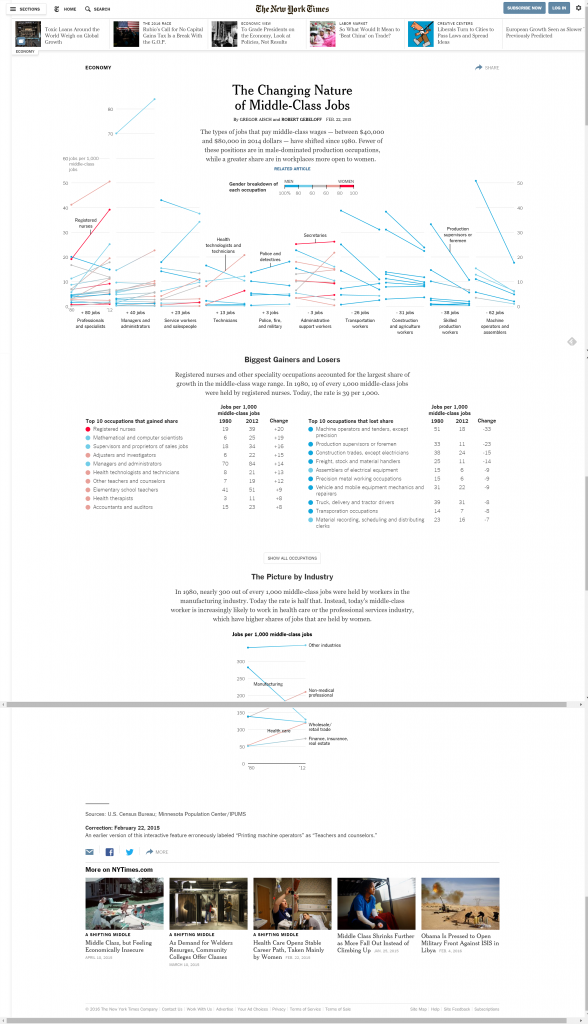
Top Graphic Evaluation
Learning Design:
Good: The elements of the chart are clearly labeled, either upon loading of the page or when the cursor hovers over them. The design of the chart also allows for comparison between multiple professions and industries by using the same chart type and measurements.
Not recommended: The amount of data included in the chart is overwhelming. For a user scenario which focuses on a specific profession it is difficult to find that profession and see how it compares to others in the sheer number of data points.
Heuristics: Contiguity, Comparison, Coherence
Usability Design:
Good: The reduction of user interaction in this section to hovering the cursor to bring up more information prevents errors and confusion.
Not recommended: There is no instruction or cue to inform the user that hovering the cursor over a data point will display a description. In addition, the categories, while perhaps reflective of the data visualized, are not necessarily easy to understand for the average user.
Heuristics: Constraint, error prevention, Match between system and real world, visibility of system status
Middle Graphic Evaluation
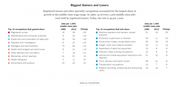
Learning design:
Not recommended: It can be difficult to find specific occupations among the high number documented here due to the fact they are organized only by the change in growth.
Heuristics: Signal to noise ratio
Usability design:
Not recommended: The inclusion of a “Show All Occupations” button does help reduce the number of elements displayed at one time. However, the button has no signal as to whether or not it has been interacted with, other than the sudden appearance of large amounts of data. In addition, once that data is displayed, it cannot be hidden again.
Heuristics: Visibility of system status, Help users diagnose and recover from errors
Summary:
This is a strong design that benefits from a nearly flawless visual design and strong design in terms of usability and learning. Users have access to a large set of data visualized in a way that is easy to understand and compare by industry or job title. The simple interactions reduce the space for error on the part of the user while still allowing them access to the data.
Many of its weaknesses are strengths in different categories. While the amount of data on the main chart may be overwhelming, it also allows users to access that data with a minimum of room for error and technical complexity. Although the graphic displaying the “Biggest Gainers and Losers” is difficult to navigate due to the method of organization, especially for users searching for a specific trade, the inclusion of further features to search through or limit the data on display would greatly increase the complexity of the page.
0 Comments